kleva health
kleva health is a company born out of response to COVID-19. They were in need of an app and website to promote and sell their at home testing kits. Working with a team of UI/UX designers we working on everything from designing and prototyping the app to testing it among users.
Role // UI/UX Designer
Category // UI/UX
In order to best design UX for this app we concentrated on solving one main problem:
1 in 3 adults are concerned about not being able to access tests and healthcare if needed.*
Americans have stress and anxiety over their accessibility to healthcare and testing. This comes at one of the worst times in history. 48% of Americans are anxious about the possibility of themselves getting coronavirus and 63% are anxious about a loved one getting it.*
Good design in such a serious and sensitive subject
Healthcare is often a very private experience for users. And with this, users’ needs vary across the board. Creating a design solution to appeal to everyone on this sensitive subject proved to be challenging.
A simplified approach helps a variety of users
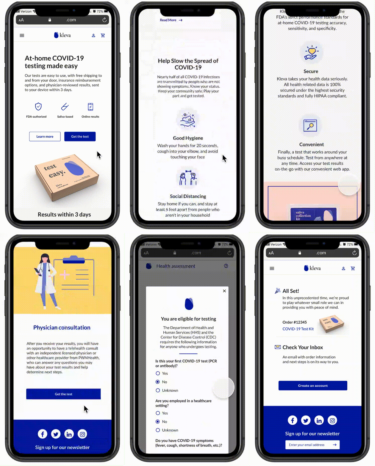
Research found that users were not very consistent in what they were searching for. The homepage was designed to be easily digested and gives a high level overview of topics users may be searching for. Users aren’t forced with too much information that they may not be interested in and can click on any topic to learn more.
Research found that users were not very consistent in what they were searching for. The homepage was designed to be easily digested and gives a high level overview of topics users may be searching for. Users aren’t forced with too much information that they may not be interested in and can click on any topic to learn more.
Reducing stress in the process
Everything was designed with this anxious and emotional user in mind. Information on the site was broken up to be more user friendly in smaller segments and avoided overly complicated medical terms or descriptions.
Efficiently navigating to checkout
Due to legal reasons, we had to make our users take a health assessment in order to qualify for a test. We made this health assessment as streamlined as possible where users would only have to click a general overview of their symptoms and wouldn’t have to go through and click each symptom individually.
The experience didn’t end after purchasing the kit
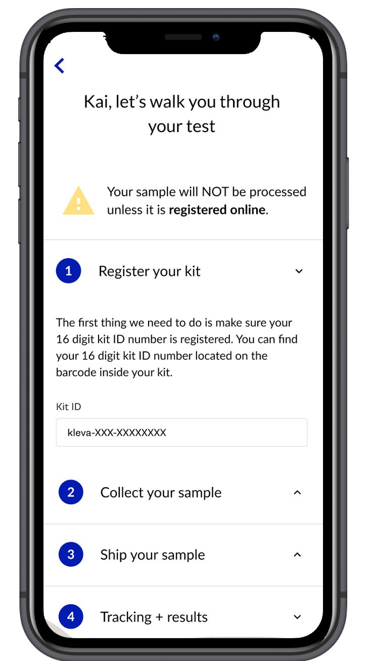
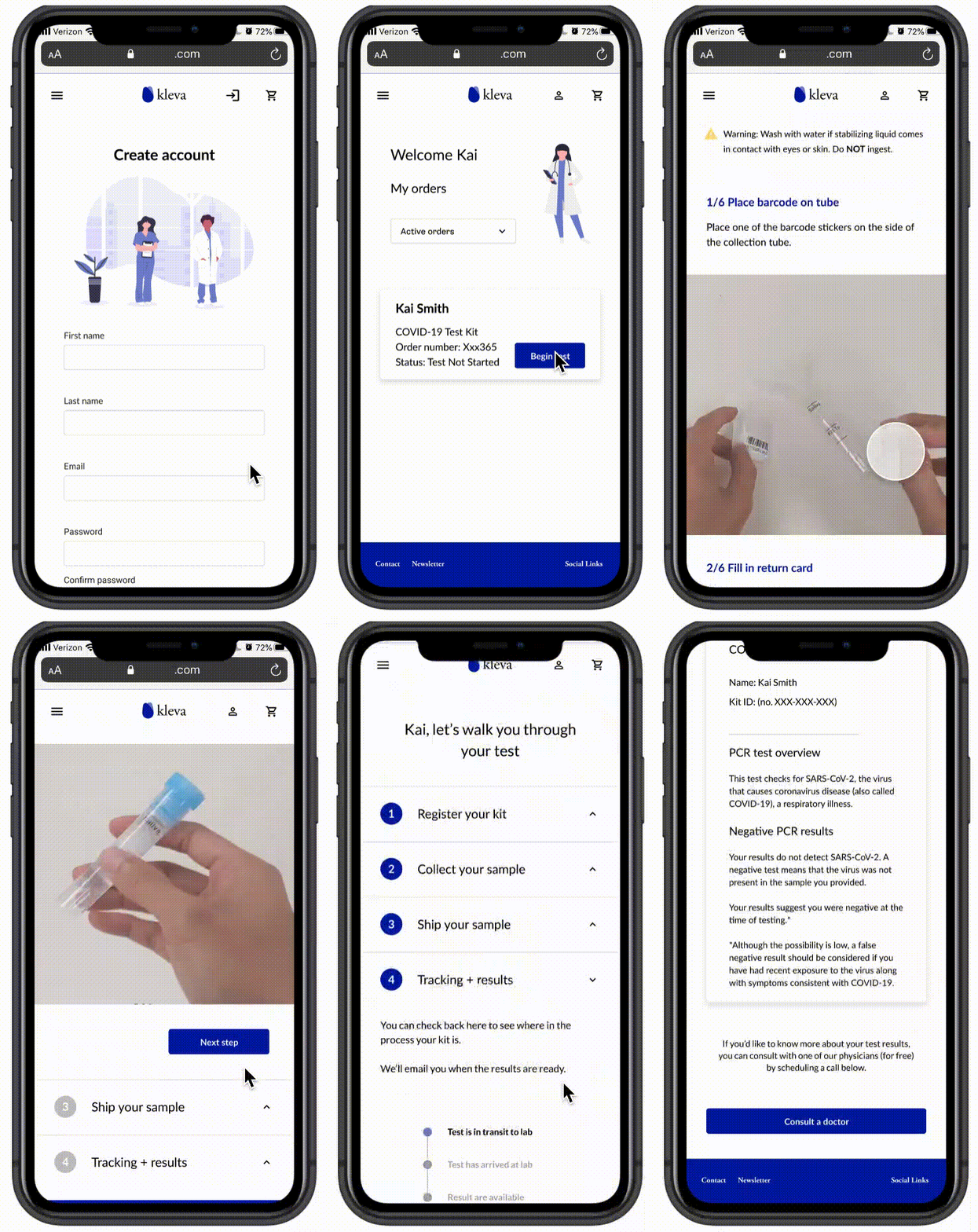
After receiving a kit the user must then register their kit online. With several steps involved with registering their kit, collecting their sample, shipping and following tracking, we broke each down into their own categories that would not overwhelm the user.
Progress on each step within each category was shown so the user knew what to expect. After previous rounds of testing found static illustration instruction images confusing, gifs were created showing how to take the test in realtime.
Knowing that users would be anxious to get their results and checking frequently, a progress bar was provided so that they could track their kit along every step of the way.


